How to pair casual style font perfectly
Thanks to Letterhend Studio for giving us permission to use this beautiful font as an asset to our Quote Maker application. Thats mean you, as QuotesCover end user, safe to use the font for your own project. Read here for license details: https://quotescover.com/font/cephalonia.
What we love about this font is that looks casual but premium at the same time. The stroke is smooth and clean. This kind of font will work for any kind of background.
How to pair it with another font?
The basic rule of font pairing is to choose the opposite look and feel of the first font. Chepalonia font feels much more casual, so we can pair it for more formal fonts. Here are the breakdown:
- Choose the different font family
The best opposite family of this font is Sans or Serif. You can still apply script family but choose the different weight or choose more cursive and have more swirl. - Choose different font weight
You can pair it with much slimmer font or monoline font (monoline = one single width line) - Choose different text irregularity
Chepalonia font has more irregularity. So pairing it with regular font will work. Irregularity here means more difference in shape and position of each letter. Another trick is to make the second font uppercase. The uppercase font will make it more regular. - Choose different font width
Chepalonia font have normal font width. So you can choose narrower font to pair it with. - Choose different letter spacing
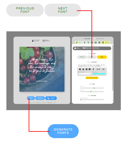
If the first font has normal letter spacing, try to separate each letter more on second text. Tips: On our quote maker app you can choose letter spacing slider to modify its letter spacing.
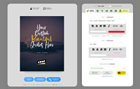
You can combine above font theory. For example on the header image above I use different font family, different font transform (I mage it uppercase on secondary text), Use narrower font, and wider letter spacing.
I will write deeper about this font pairing theory. Stay tuned!


